Trevello Host Travel Agency
Trevello Host Travel Agency
Host Travel Agency
Host Travel Agency

Services
Services
Visual Identity
Visual Identity
Digital
Digital
Marketing Materials
Marketing Materials
Brand Strategy
Brand Strategy
Client
Client
Trevello
Trevello
Location
Location
NM+U
NM+U
Year
Year
2025
2025
Info
Info
Trevello is one of the largest host travel agencies in Canada, managing a strong market position with deep roots in the Canadian travel industry. With expansion into the U.S. market underway and plans for continued growth, the existing brand identity was no longer positioned to resonate with a new audience or reflect the company's market ambitions.
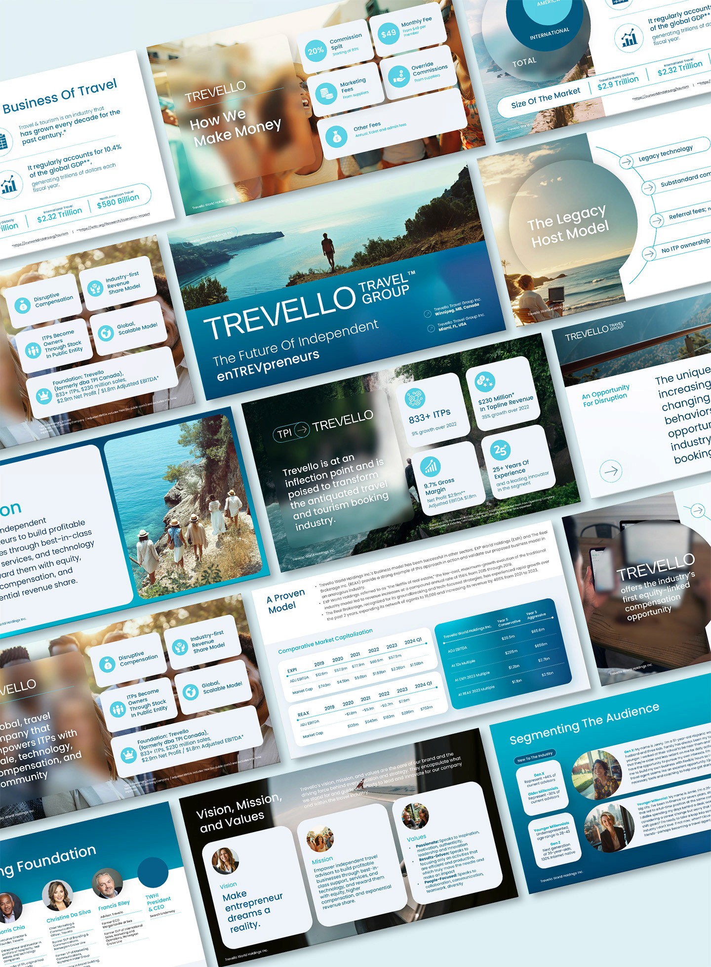
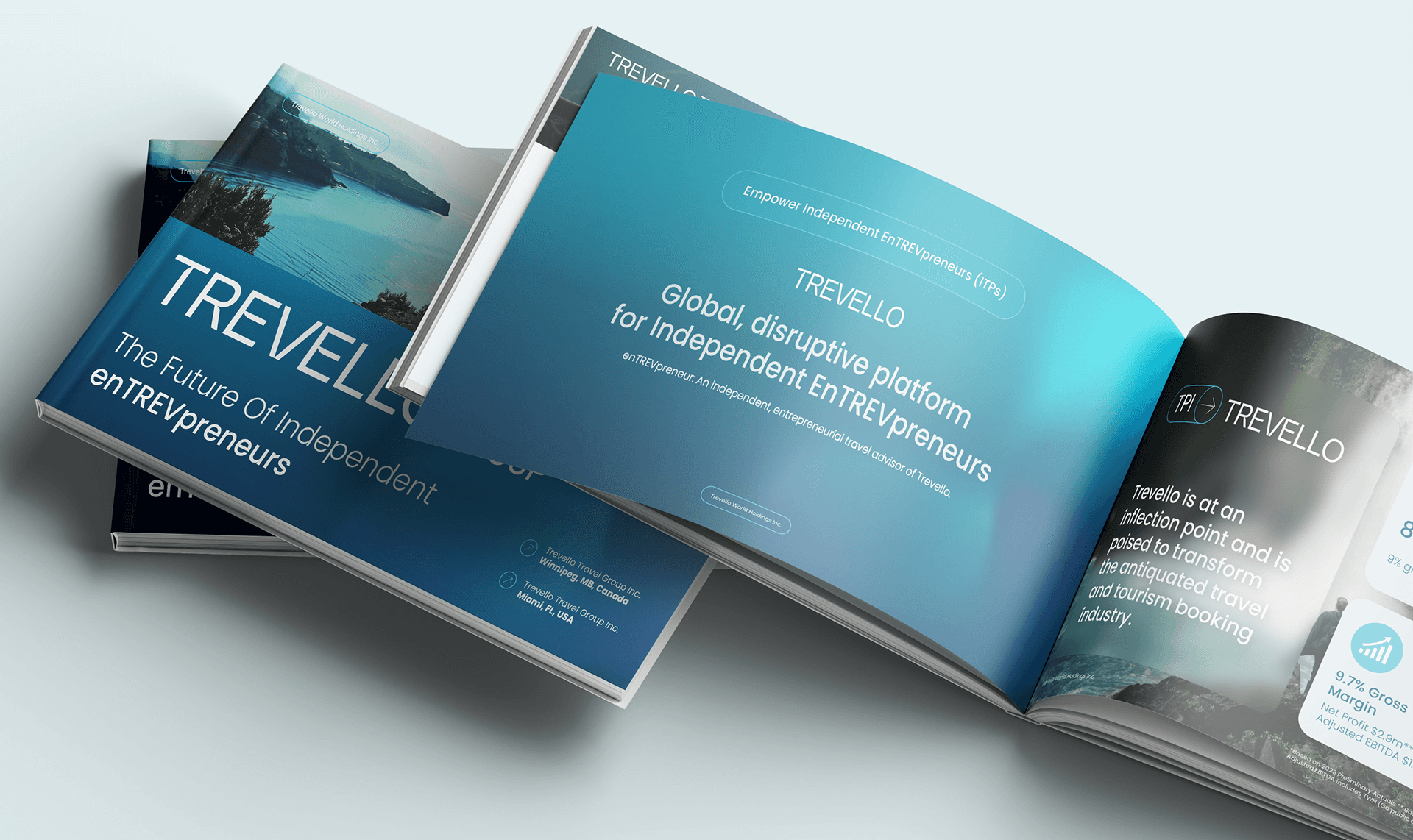
I was responsible for developing the visual strategy and brand positioning, designing the new logo and identity system, defining the color palette and look and feel to differentiate from competitors, the website redesign, and developing comprehensive brand guidelines and collateral materials. The goal was to create a clear, differentiated brand presence that could scale across all marketing and communication channels, giving Trevello a cohesive platform to launch and grow in the U.S. market while maintaining its established leadership in Canada.
We chose our brand’s color palette, rich with shades of blue—from deep oceanic hues to the lightness of a clear sky—not only for its uniqueness in a competitive market but also for its profound symbolism. Blue represents the vast, endless oceans that connect continents and cultures, embodying the spirit of exploration and adventure that defines our brand.
The deep blue mirrors the mystery and depth of the oceans, inviting travelers to dive into new experiences and uncharted territories. Sky blue, on the other hand, symbolizes the limitless possibilities travel brings, reminiscent of expansive skies that invite us to explore beyond the horizon.