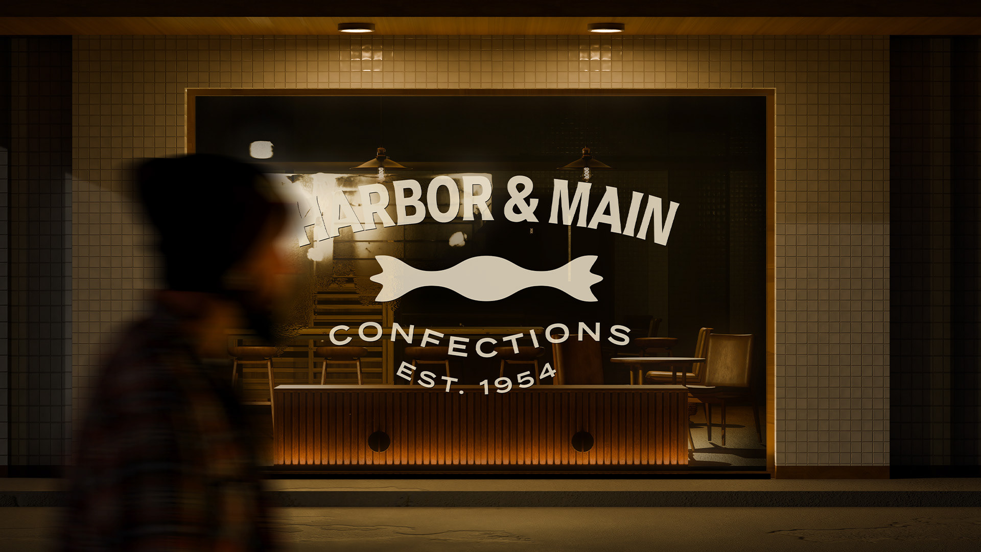
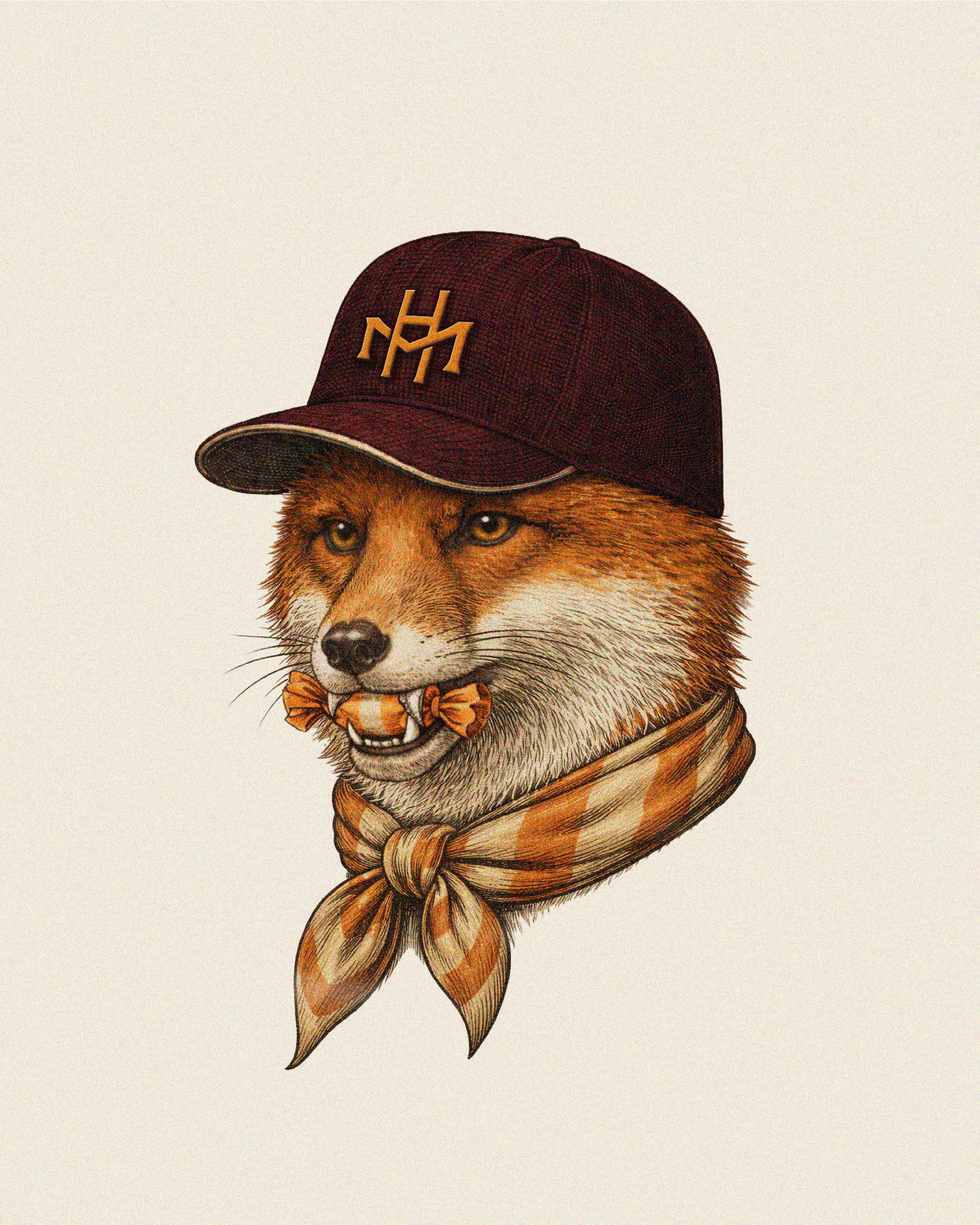
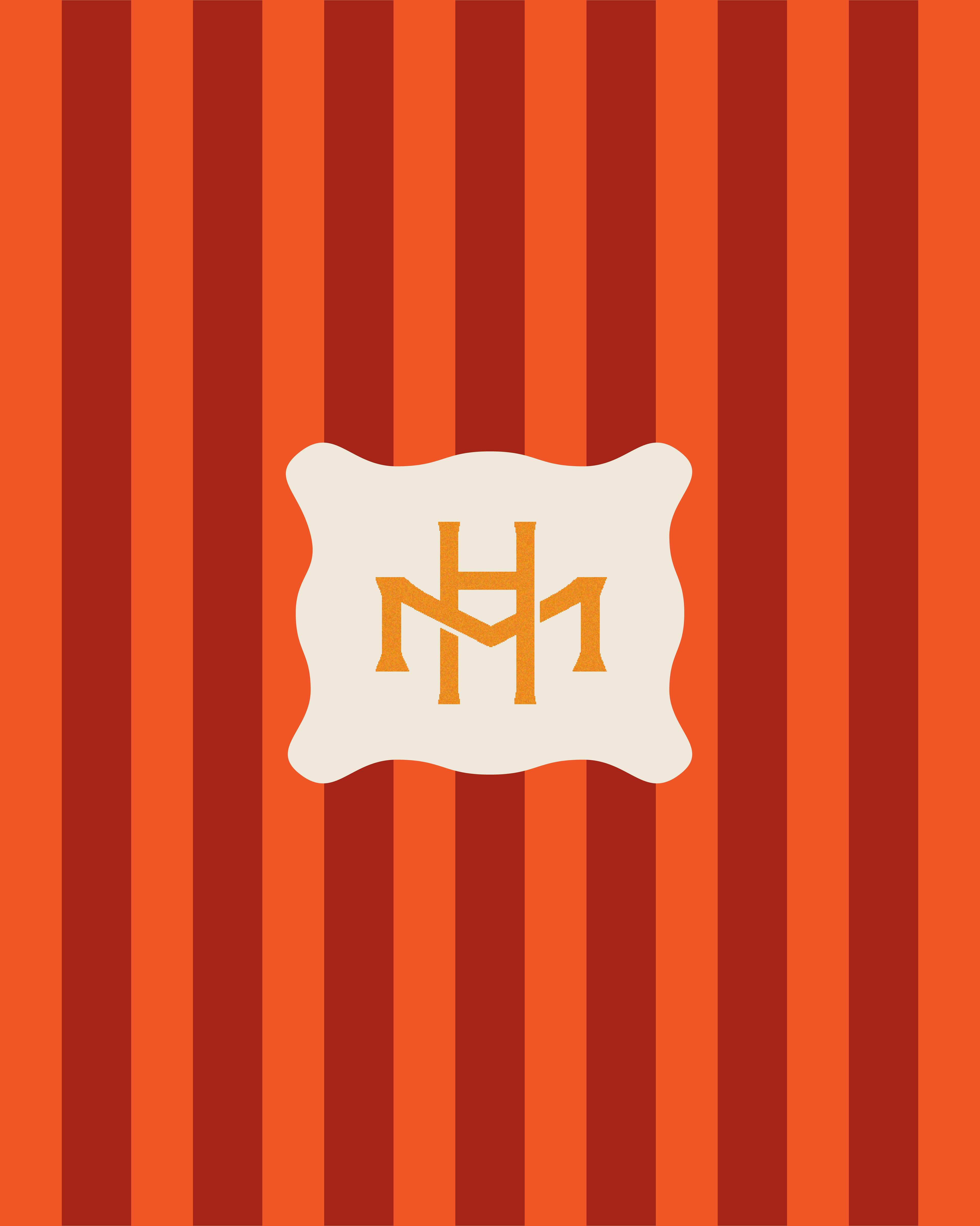
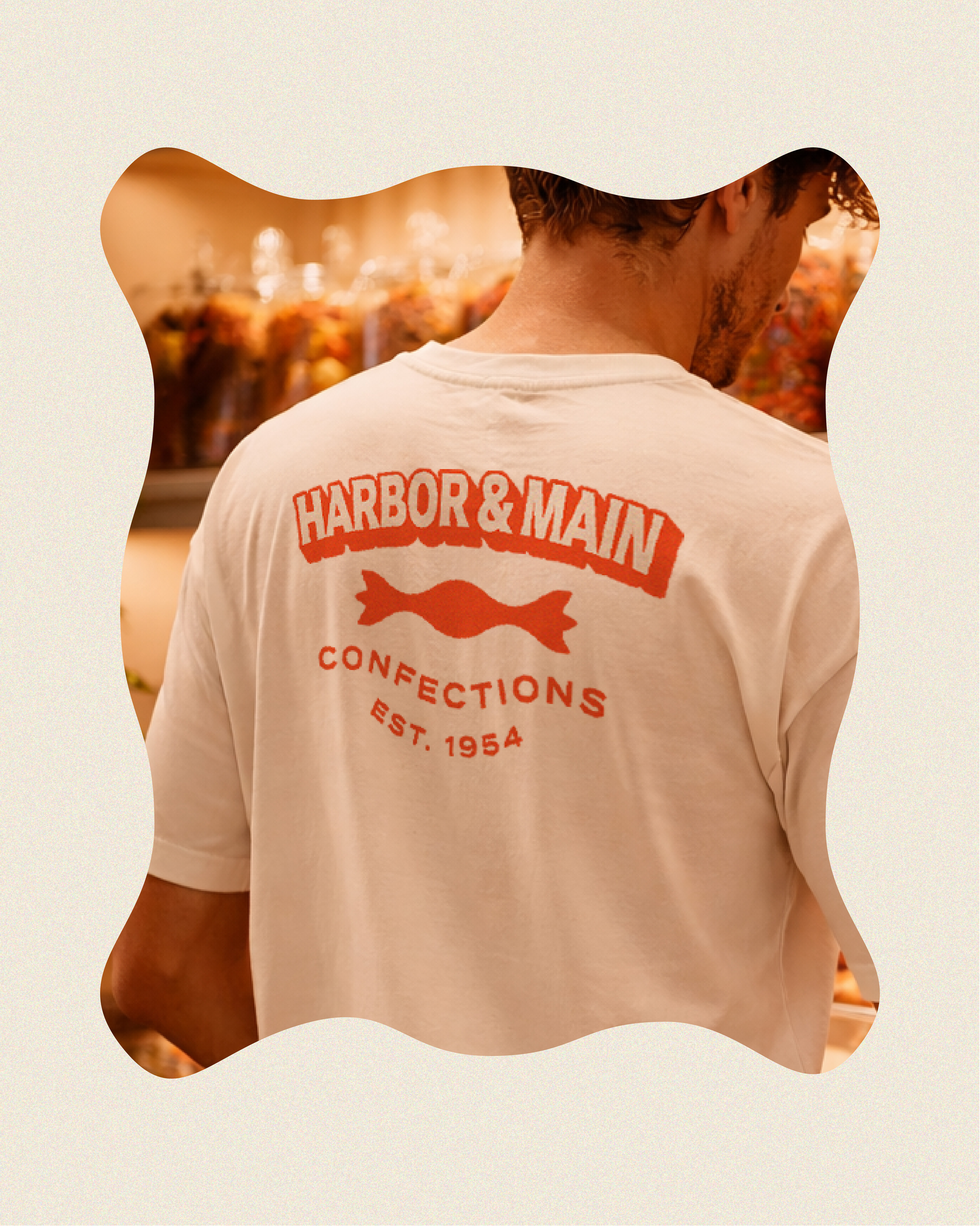
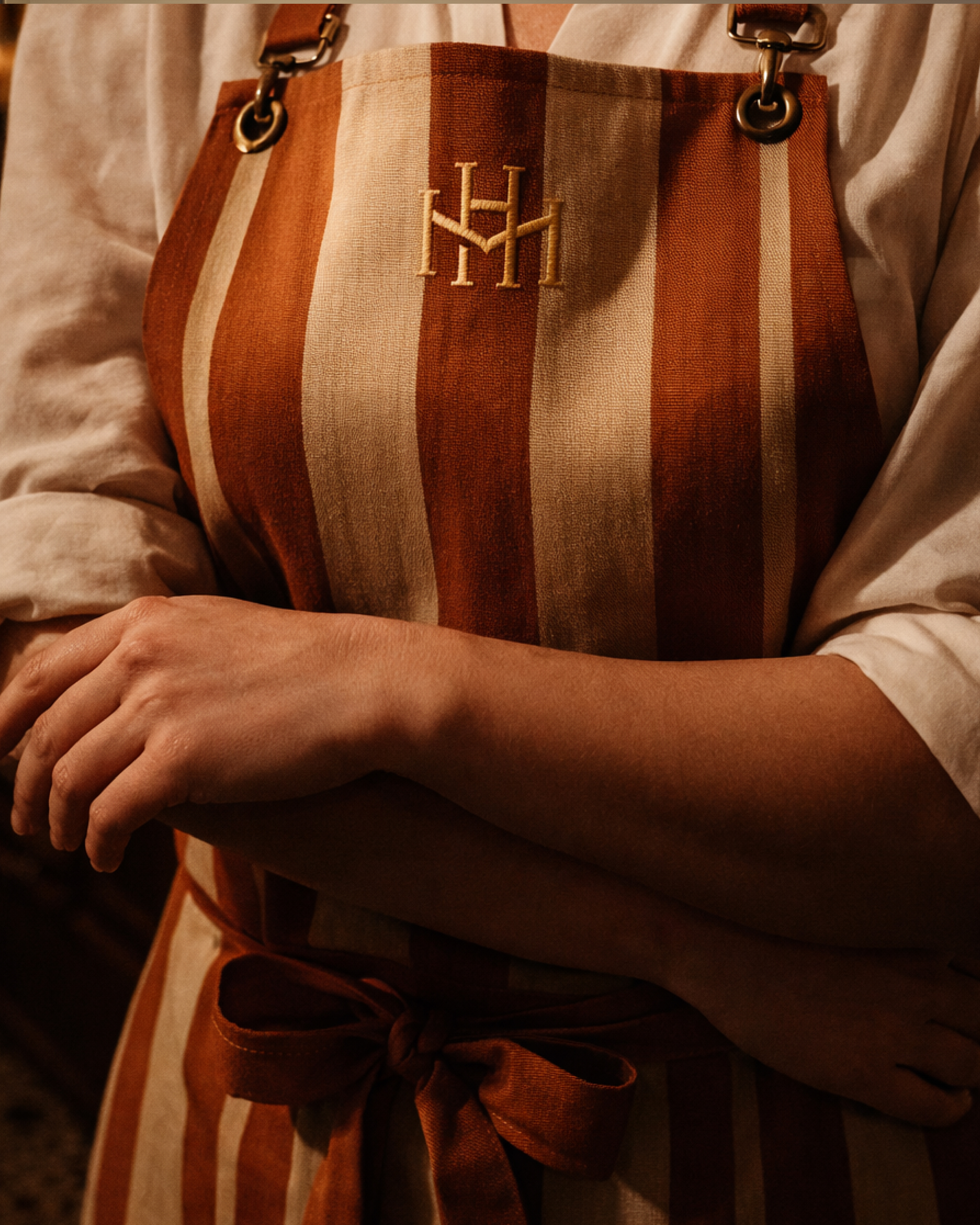
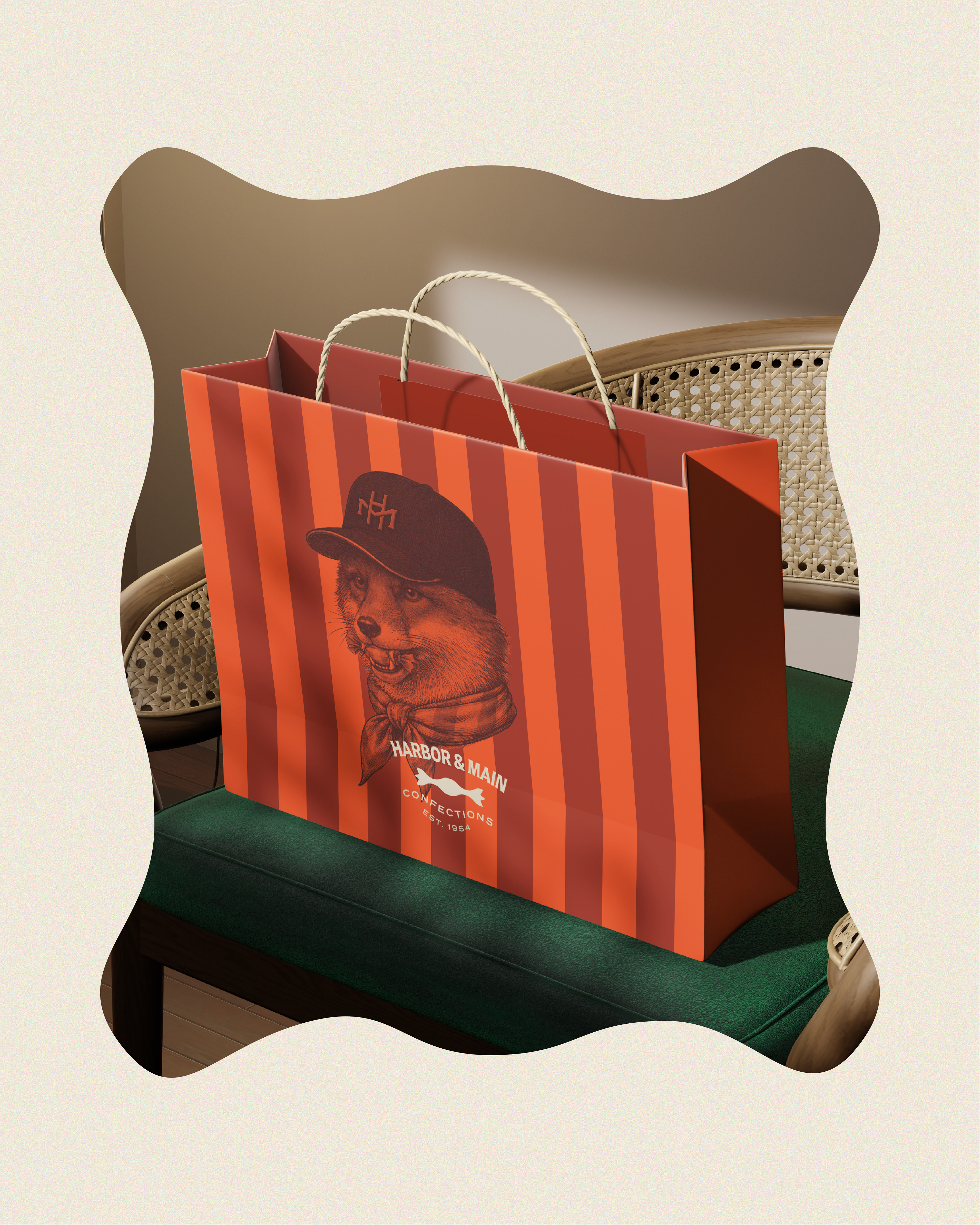
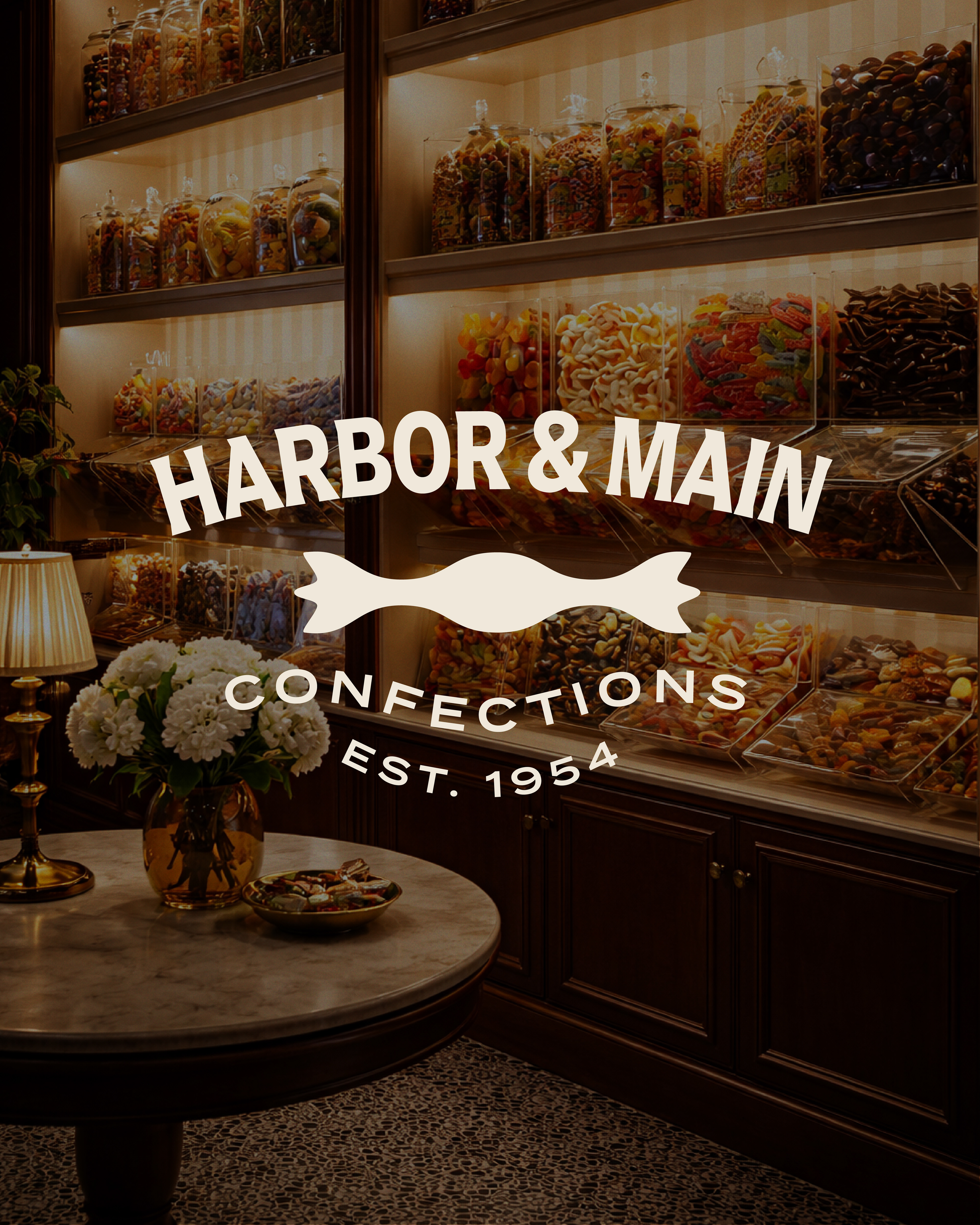
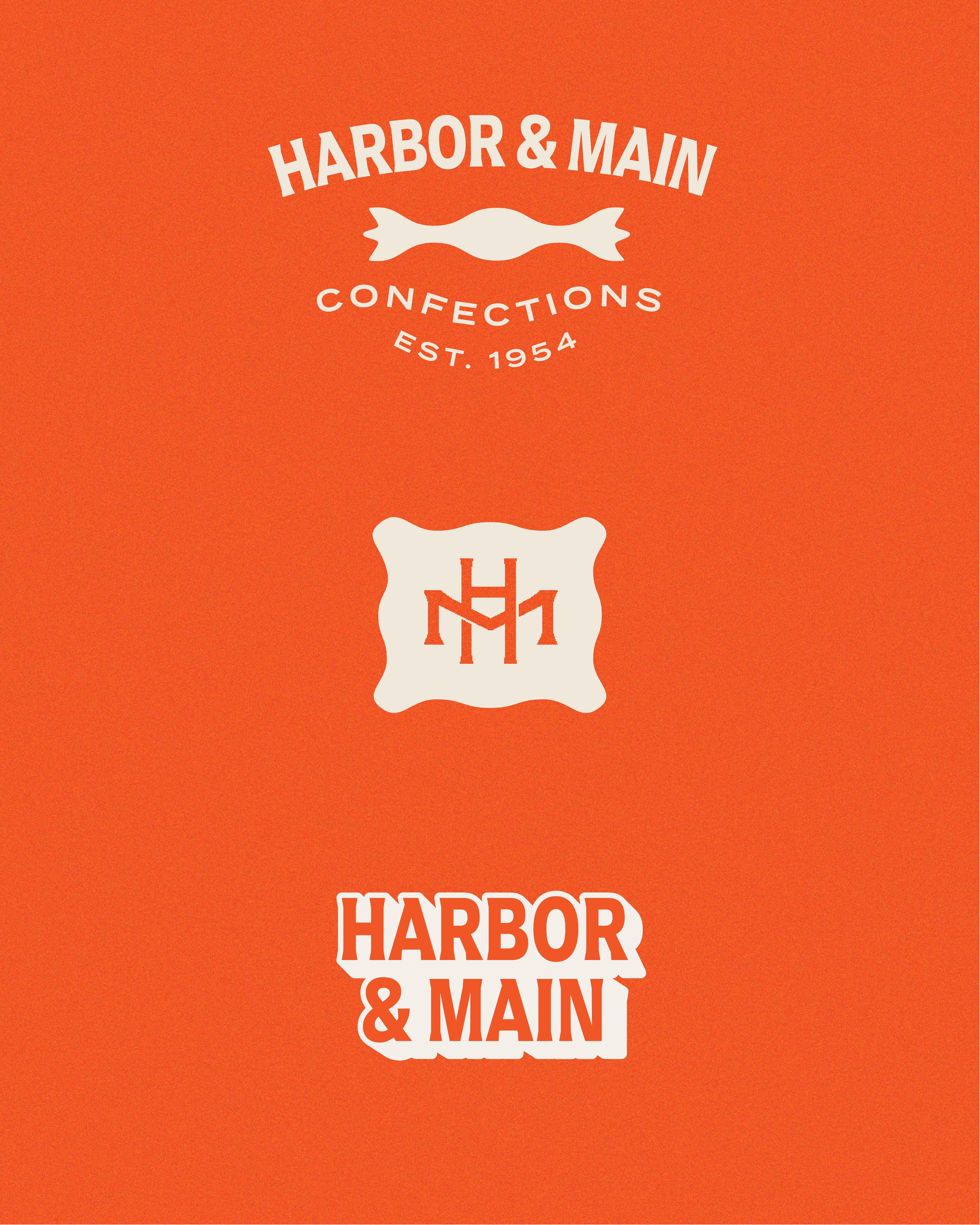
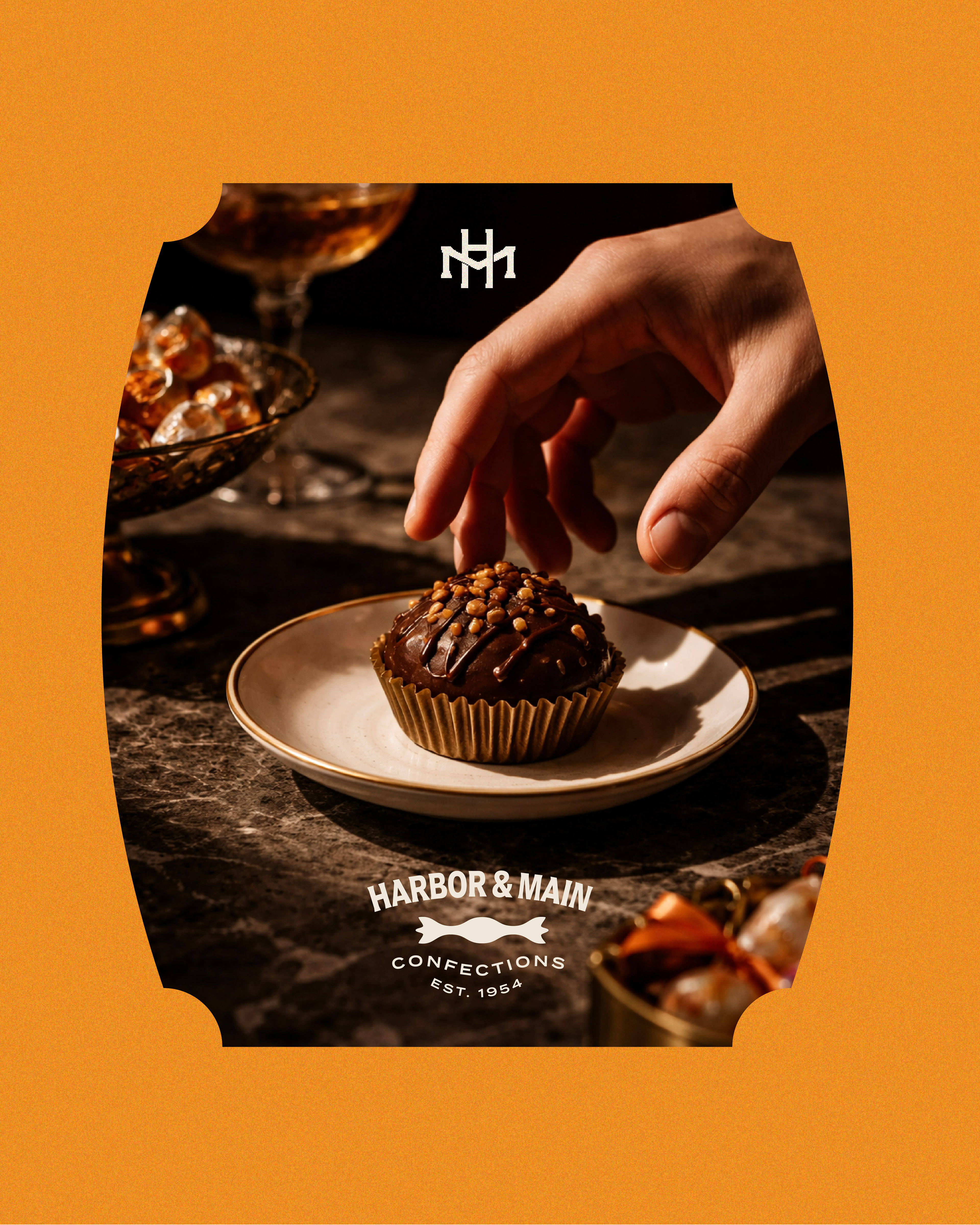
Harbor & Main is an imagined candy shop that's been on the same corner since 1954, and never quite grew up. The goal was to design a heritage brand with a grin: something that could sit behind a marble counter full of glass jars and still look right on a baseball cap. The system pairs old-world cues with a bit of mischief. A stacked HM monogram reads like an engraved family crest. The main mark works on two levels: it's a twisted candy wrapper, and it's also a bridge, nodding to the harbor the shop takes its name from. A bold drop-shadow wordmark brings the street-level energy, and the fox mascot holds it all together, part shopkeeper and part troublemaker, caught mid-bite in a cap and a striped scarf. Bold tangerine and brick-red stripes, wavy wrapper-shaped frames and a warm cream base carry the identity across packaging, signage, uniforms and merch. It's a brand that feels inherited but doesn't take itself too seriously.